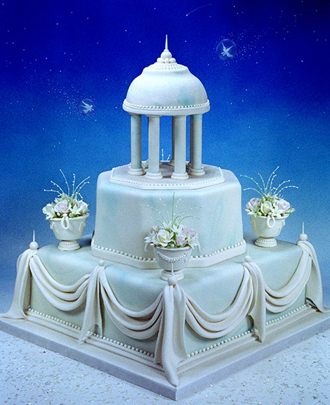
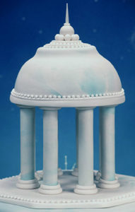
The top tier of this design was inspired by the ancient Roman building, the Temple of Vesta. The structure’s firm foundation is established with a very high square tier, followed then by a slightly shorter octagon with the square corners cut off, and ending with a circular dome, topped with a pinnacle moment. The sugar point finishes off the tip of the pyramidal shape which carries the viewer’s eye aloft to extend even past the object into the night’s sky.
Before I begin to share my thoughts regarding cake structures, let me emphasize that there is never one way to do anything in the fine art of cake decorating. So when suggesting an equilateral triangle or pyramid shape to keep in mind when structuring the tiers, I present the concept in order to help those who are somewhat frustrated with the final shape of their tiered cakes.
I would like to impart the concept of how to generally structure multi-tiered cakes, those with three or more tiers. There is a good reason the word “power” is associated with the pyramid shape. For if this shape is in the back of one’s mind when deciding tier size and height, the end result will be stronger and more powerful in appearance.In just a few words, one can describe a pyramid as a three-dimensional structure, which has at its base, a firm, strong foundation, with balanced sides reaching up to a pinnacle point.Whenever designing a cake sculpture, wedding or otherwise, including arranging flowers, I always have a triangular formation, or a three-dimensional pyramid shape in the forefront of my plan for design. For instance, if a cake does not have a wide enough base for its height, the object will look more “necky” and cylindrical, like the leaning “Tower of Pisa.”
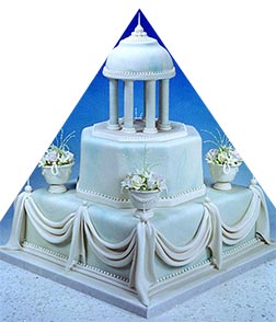
When choosing tier sizes, imagine two lines drawn from the widest corners starting at its base traveling along the upper edges of the remaining tiers, eventually meeting at the very top. So in other words, one should be able to draw a two-dimensional, isosceles triangle on a cake picture which follows the edges of the outline of the tiers to its peak, as shown below.
When flower arranging in any art form, start with the largest varieties first, and arrange them in a triangle in relation to each other. Then continue on with the medium and small filler flowers in the same fashion. You will find there is less deciding in the decorating process using this trick, and the end result will be a balanced arrangement.
And too, if one does not create a pinnacle moment at the top, the energy of movement in viewing it, will stop suddenly. Sometimes I have marveled at another cake artist’s absolutely beautiful cake design, but which has a rather flat, top-tier decoration. To me a flat top always diminishes its power. One needs to imagine that the cake literally is reaching up to the stars until it vanishes. Otherwise, a flat appearance at the top will stop the eye’s movement and reduce the effect of looking upon it.
Simply a bud or tendril reaching up past everything else may be all that is required, or even just a pointy bit of sugar dough. Keep in mind too, if one rounds the top tier a bit before covering it with flowers, it will be easier to create a higher effect at its pinnacle. For basket cakes in particular, round the top layer of the cake, by carving and beveling its top edge, so that the floral arrangement would appear rounder and less flat.
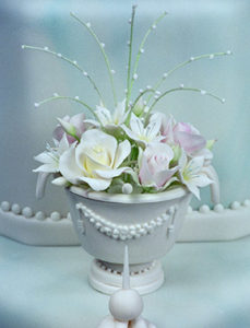
The small decorative urn above was formed merely with circle cutters and a little royal icing piping detail. The main cup is formed by cutting a large round of sugar paste and then setting it over a small bowl or sauce cup until firm.
One other essential measurement to consider is the height of each ascending tier. If one makes all the tiers the same height, then the inevitable result will be a shape that is more “neck”. I suggest that each tier, as it decreases in size, needs to be slightly lower in height too than the previous layer, about 1/2 – 1 inch less (1.25 – 2.54cm) depending upon the size of the cake. Otherwise, the smallest tier will end up looking too cylindrical if frosted at the same height as the large bottom tier. And if the pans used to bake the cake are too close in diameter, the end result will again be narrower looking and taller rather than broader and stronger. Often, I choose pan sizes that are 3 inches, or more commonly, 4 inches (10cm) different in diameter. That will allow for plenty of room for flowers to set upon the ledges. Large flowers set on narrow ledges of a tiered cake, in my opinion, look unstable and squeezed into place. But again, sometimes that can be the perfect choice for a specific design. These are just common considerations shared when structuring a wedding or tall celebration cake. The higher the height of a tier in proportion to its diameter will create a skinnier and taller appearance, rather than a stronger look of a pyramid-like structure.
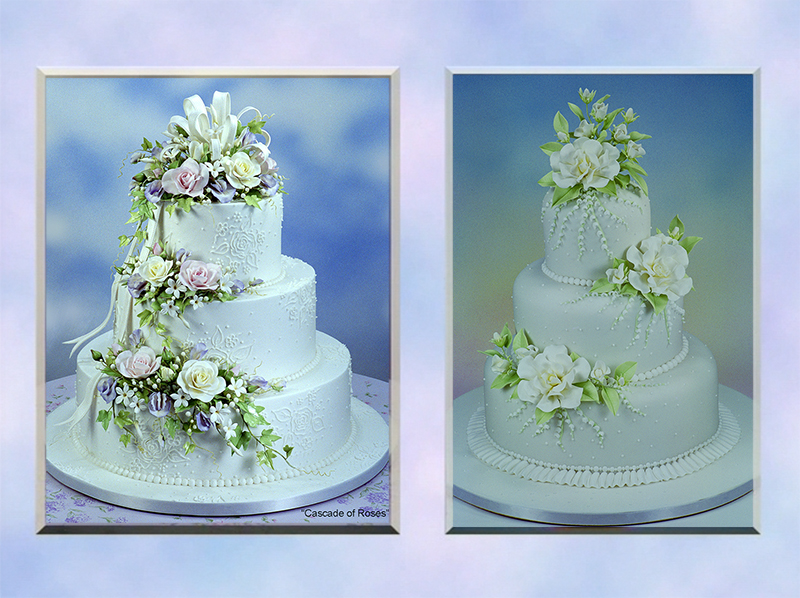
The tiers of the left cake design have a shorter height in proportion to the diameter of each tier, as compared to the cake on the right which has taller tiers in proportion to their diameters. You can see in this comparison, the design on the left has a stronger, more powerful look than the narrower looking cake on the right.
In some cases, one may want that slender, taller look for a certain design. However, the cake artist needs to be aware that the height of any tier in proportion to its diameter will affect the final look.
The two cakes, “Dream Come True,” and “Cascade of Roses,” above to the left, would approach more closely the powerful Pyramid of Giza’s structural proportions than the cake does on the right.
That narrower cake design was created in 1998 for the somewhat infamous sport’s broadcaster, Marv Albert, and his current wife, Heather Faulkiner. She was very pleasant to deal with, and he was not, barely wanting to pay for the cake. The caterer told me too that Mr. Albert wanted to keep costs down so low that there was barely enough hors d’oeuvres for the guests at their very small wedding reception. And this was someone who was living in the penthouse apartment of the ABC building on Columbus Avenue in New York City.
Cake designers need to wear their “Ruby Slippers” when approaching any customer in order to guard against them dominating the consultation, under-appreciating the labor involved, or under-valuing the artist’s talent who is making their celebration cake.
Here is a short animation from DVD#6, “Cake Art Business,” where the theme of an artist’s self-empowerment is illustrated in full. I created a character named, Gertrude Gottrocks, who symbolizes for me, many of the challenging, wealthy customers I had to deal with while designing cakes in the Big Apple for over thirty years.
I enjoyed doing the actual voiceover for her character. It was kind of cathartic after all those years, commenting on the character’s rudeness every time she appears in the DVD set. The clever animation graphics were created by Broadway actor, Bill E. Dietrich.
So to conclude, have a pyramid shape in mind when creating your next tiered cake design. It will bring power to your work, and strongly affect people gazing upon your grand edifice of cake.
Power to the artist!
Scott Clark Woolley
